The Making of Pation

In the beginning of summer in 2015, I started absorbing ideas for my next theme. It was the summer before I entered my sophomore year of college.
The Inspiration
I flew back to Taiwan and stayed over summer. When I first landed in Taiwan, it hit me hard that this place where I grew up is so familiar, yet foreign to me. The way people interact, think, and ideas people have, between Taiwan and America are vastly different. I had the realization that all the thoughts we have are subjective and greatly dependent on our background.
Over summer I rewatched the movie American Beauty, it also touched upon the idea that the way we think are subjective to each person. It emphasizes the difference on each character’s perspective by shifting the viewpoint constantly, with control (Angela, Ricky’s Dad) versus chaos (Lester & Ricky) and materialism (Carolyn) versus realism (Jane).
The Design of Pation
I wanted to build something to represent this notion on how things are subjective to individuals, the way you see it is different from the way I see it. To represent this idea, at first, I thought of changing the background color when scrolled; but it wouldn’t exactly match this idea, it aligns more with the idea of “creatives are always bettering and changing themselves”, which is and idea I’ll be touching upon in future themes. A few days later, a new idea popped into my head – make the post size randomized, so that everyone sees a different layout. It matches this notion that everything we see is subjective perfectly.
I set out a goal to not use any borders or box shadows when designing Pation. With my previous themes, the aesthetics relied a lot on borders and having a boxed layout makes it easy to build clean looking thems; some great examples are the Carter and Alumia theme. Pation on the other hand, has no borders, the module grid that keeps the layout consistent relied on the navigation links and text on the corners, it subtly projects a container.
People liked the TV noise loading effect. It was an idea borrowed from my friend Max, he thought of the idea back in 2014, with the effect on photo mouse over; I moved the effect onto posts loading instead. Besides the TV noise, I’ve also added the LSD loading effect, inspired by the transition between scenes in the L$D music video directed by Dexter Navy; when the option is turned on, it will load in with the LSD effect instead of the TV noise effect.
The Naming of Pation
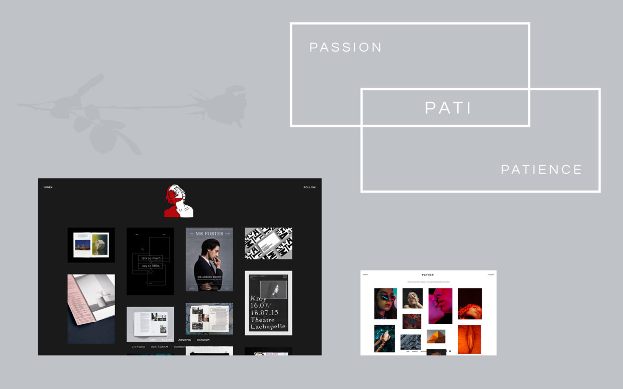
During the final weeks of working on Pation, I was struggling with coding on the permalink pages (post page). I needed to make posts always smaller than the window yet at their largest size, then they had to be centered in the middle. It took me a week to figure out how to properly build the function, and the mission to finish up Pation became a long, long haul. At the same time I watched the VICE interview with Phil Tippett, he spoke about how artists always experiences frustrations by the end of a project, and to complete a project, you need to have both passion and patience in your craft. The word passion and patience both derive from the Latin word “Pati”. I added the suffix “ion” in the end to denote the action of working on your craft.
You can check out a live preview of Pation here, and get the Tumblr theme here. I also welcome an questions and discussions, feel free to reach me here.