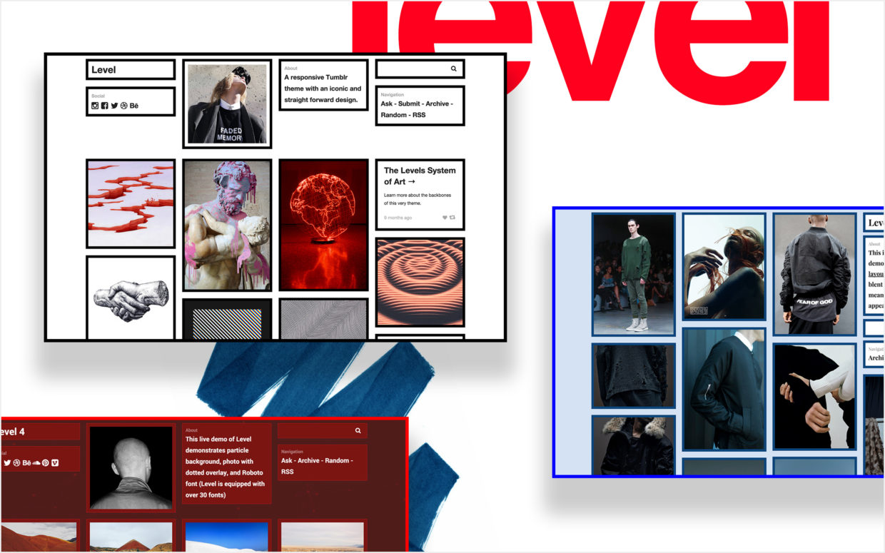
The Making of Level

The idea for Level first popped up around early 2015, but Level didn’t come to a concrete design until May 2015. There are two main ideas running through the design: (1) to incorporate the vibe of New York City and (2) a 3-2 designs on the level system of art.
In the winter of 2014, it was my first long stay in New York city. During that time, my friend and I wanted to create a fashion brand, and we were working on it day and night. We woke up every morning and would go outside to take street snaps, find cool people with interesting style, write notes, find factories, etc. However, that didn’t really work out as we both had too much going on, though we may still do it at some point of our lives. Although the fashion brand didn’t work out, over time, I had the chance to immerse myself with the city, experiencing the winter, the grids, and the people.
At the same time, I started realizing that a truly brilliant piece of work (could be a brand, movie, track, etc.) doesn’t just come with having a great appeal, but also a deeper meaning or idealogy attached to the piece itself. On the opposite side, I also started to think of the actual meaning behind fuccboi. It isn’t just the stereotypical style and outfits that people recognize, but also the lack of meaning or reasoning behind the fuccboi’s action. It can also be taken further when the fuccboi is trying to make art, then blatantly copy others work, instead of thinking deeper or re-inventing the creative. I call this fuccboi-ism. Bringing the idea of incorporating storytelling into creations, back to web design; I thought to myself that web design holds the same ability as any other art forms to create a deeper level of art. So, the idea of turning Zen Themes into a storytelling project arose.
The Design of Level
I immediately started brainstorming the ideas for Level when I finished Carter, the focus being how I can combine a storytelling method into this theme. I thought of the idea of having thick strokes not only to represent the grid system of the city, but to showcase the honesty of the city on how the good, the bad, the beautiful, and the ugly, are right in front of you with no obscurity. One thing that particularly stood out to me was how little Italy and Chinatown are neighboring with each other, creating an enormous difference in it’s atmosphere. To bring this idea into Level, I made the front background come directly onto the accent color creating a huge contrast. To symbolize the harsh, rigid, and American vibe of the city, header/sidebar and the action buttons are defaulted in bold Helvetica.
Around the same time, my squad developed the level system of arts (the origin of the theme name), a way of classifying art pieces into artiness and goodness. With Level, I wanted to bring the 3-2 dimension of making a chill theme with ironic elements that only designers will be able to tell. To make something ironic and intentionally done wrong in terms of the design, the contrasts and strokes was a great way to demonstrate this, as many web designers shy away from having bold, attention-grabbing elements. I’ve also added elements like strikethroughs on links when hovered. Though I admit that Level is not done well on the being ironic part, so it became a 3-3 design on the level system. The ironic aspect is something I’ll be exploring more in a future theme.
On the Technical Side of Things
Level wasn’t particularly difficult. I’ve always wanted to completely understand Ajax (the post popups), and Level was a great opportunity. I did have some challenges running the masonry function (grids) again when the popup is fully loaded, and also running Ajax clicks again on infinite scrolling loaded posts (the function loads new posts using Ajax). One interesting fact – the progress bar doesn’t actually indicate the loading progress of the content. It’s a complete stand-alone piece using keyframes to have it run from left to right, firing each time the popup is activated.
I welcome any ideas or discussions, so feel free to email me to discuss further. You can also tweet me at @thejenyuan if you have any short questions. Additionally, you can sign up for the mailing list to receive updates on new themes or any major updates. Click here to check out Level.